Within Reach
Why CoinAiLyzer was built for your thumb.
A coin is a one-handed object. So is a phone. Everything about the capture screen - where the toggle sits, where the feedback appears, what got pushed to the top - comes out of that one observation, and out of a loading spinner I watched ten years ago.

CoinAiLyzer provides educational grade estimates and research context. It does not certify, authenticate, appraise, or provide financial advice.
There's a sound I still remember from 2016. It was the whir of a loading spinner that wouldn't stop.
I had just joined Chubb, right after the company acquired the old Chubb and took its name - one of the bigger insurance mergers of the decade. My early projects put me on the technology side, helping build a platform meant to support our international operations and, eventually, scale across new lines of business entirely. The idea was ambitious in the right way: one system, built to last, that could grow with the company instead of getting replaced by it in five years.
But somewhere between "ambitious" and "shipped," the system got slow. Pages hung. Screens waited on the network. Users learned to expect a pause before anything happened - and they hated it. It became such a running joke inside the building that one of the managers who'd championed the whole project started calling it, only half-joking, "the spinning wheel of death." That name stuck longer than the platform's roadmap did.
I didn't build that system. But I watched it get built, and I watched what happened when the people making decisions about it lost sight of the people who had to use it every day. Speed wasn't a "nice to have." It was the difference between a tool people reached for and a tool people learned to dread.
That lesson followed me. And it's a big part of why CoinAiLyzer looks and feels the way it does.
The design brief nobody wrote down
When we started sketching what an AI-powered coin grading app should look like, there was a version of this product we could have built and didn't. We could have built a new machine for the workbench - another piece of gear, another login, another interface you'd have to learn from scratch, with its own conventions and its own learning curve. Numismatics already has plenty of that: proprietary scanners, standalone software, reference books you have to know how to search.
What we wanted instead was something familiar. Not a new machine - an extension of something you already carry, already trust, and already know how to hold.
You already own a camera. You already have decent lighting wherever you are. You already have the internet, and you're probably already part of an online community of collectors and dealers who trade tips, photos, and opinions. And - this is the part that actually shaped the interface - you already have something that fits in your hand while you turn over one of the world's oldest and most deliberate stores of value: a coin.
The question wasn't "what new tool can we hand people?" It was "how do people already hold things when they're paying close attention?"
And the answer, for a coin, is the same answer for a phone: in one hand, thumb doing most of the work, held close, tilted toward the light.
The research behind the reach
It turns out there's real science behind this instinct, and it's worth naming because it's easy to dismiss "thumb-friendly design" as a nice-sounding phrase rather than an actual constraint.
In 2013, UX researcher Steven Hoober published a study for UXmatters based on watching 1,333 people use their phones in public. Of the people he saw actually touching their screens, about half were operating the phone one-handed, over a third were cradling it in one hand while tapping with the other, and the rest used two hands. Hoober mapped out what he called reach zones - the area a thumb can hit easily, the area that's a stretch, and the area that requires actually shifting your grip. The easy zone sits low. The hard zone sits up in the corners, especially the far top corner from your thumb.
Josh Clark picked up that research a couple of years later in his book Designing for Touch and put a number on it that's since become one of the most quoted stats in mobile design: roughly 75% of phone interactions happen via thumb.
"Top versus bottom is more important than left versus right."Josh Clark, Designing for Touch, 2015
No matter which hand's doing the work, the bottom of the screen is where things are easy. The top demands effort. Drag the map below with the hand toggle and the geometry holds either way - the corner that's hardest to reach just swaps sides.
You can see the entire mobile industry quietly agreeing with this.
From drawer to bottom bar
Navigation used to live in a slide-out drawer you had to reach up and pull open. It moved to a bottom bar so the most common taps sat under the thumb - with Now Playing docked below the nav, so play and pause never move.
Lower-right, and sheets that rise
"My location" and start-navigation both sit in the lower-right corner, where a right-handed thumb rests. Tap a destination and the details rise from the bottom in a sheet you can pull up or ignore - the map stays live under your fingers.
None of that is decoration. It's the same finding, over and over: put the things people do often, and the things people do while moving or distracted or one-handed, low on the screen. Put the things people do rarely - or just glance at - up top.
What that looks like when you're grading a coin
CoinAiLyzer's capture screen follows that same rule, and once you know to look for it, it's obvious. The bar across the bottom - the one holding the auto-capture toggle and the live feedback that tells you "move closer" or "capturing…" - sits exactly where your thumb already is, because you're holding the phone in one hand while your other hand is holding the coin.
The step control that tracks whether you're on the obverse or reverse sits at the top, because you only touch it once per side. The settings icon and the back button live up there too, for the same reason: you don't need them mid-scan, so they don't need to be in your way.
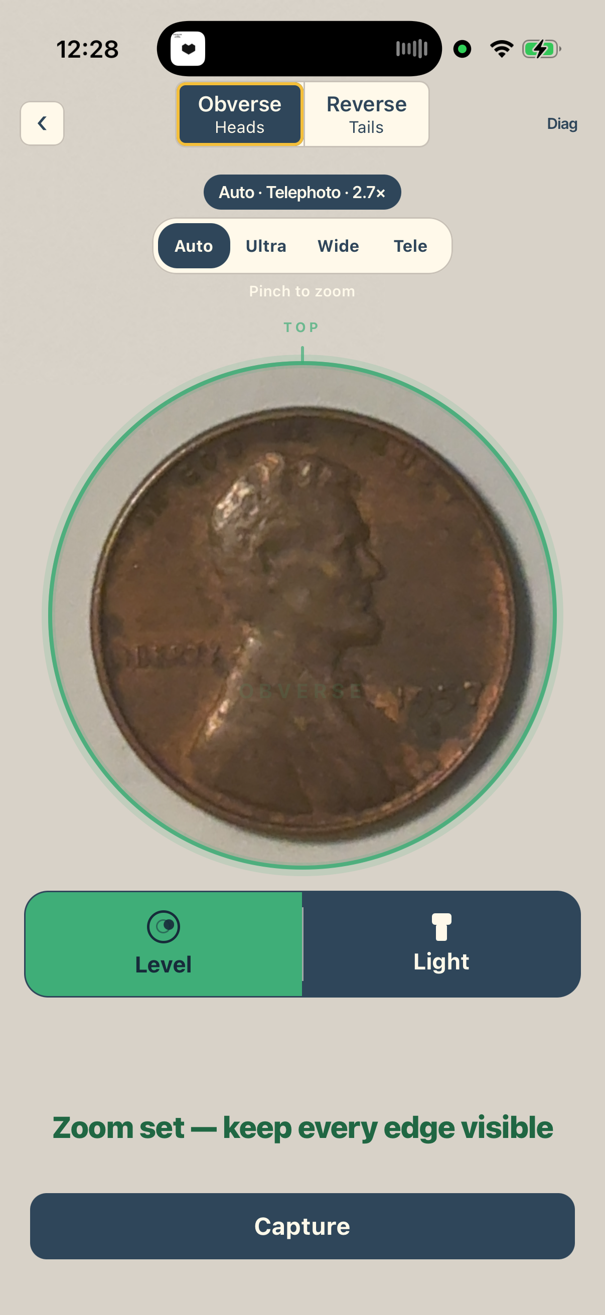
That's not an accident, and it's not just good manners toward your thumb. It's the same argument I kept coming back to after watching that spinning wheel spin at Chubb: if the tool makes you think about the tool, it's already failed at the one job that matters, which is getting out of the way of the thing you actually care about.
And what you actually care about, holding a coin up to the light, isn't the app. It's the coin. The mint mark you're squinting at. The wear pattern that might mean the difference between a $40 coin and a $400 one. The small thrill of not being sure yet.
An extension of your eyes, not a replacement for them
I want to be honest about what CoinAiLyzer is and isn't. It's not a substitute for the knowledge in your head, or in Daniel's head, or in the head of the dealer three tables down from you at a show who's been doing this since before either of us were born. It doesn't carry forty years of handling coins. What it can do is put a second pair of eyes - fast, consistent, backed by real pricing data - right there in your hand, in the same motion you already use to turn a coin toward better light.
We built it to feel like the coin itself: something you hold, tilt, and examine closely with your thumb and index finger, not something you set down on a desk and operate with a mouse. That's the whole design philosophy in one sentence, and everything else - the bottom bar, the capture ring, the "should I slab it" flag - is just that philosophy worked out in pixels.
It's not finished. It won't be finished for a long time, because the hobby itself keeps changing and so do the tools people need for it. So if you're using the app and there's something you wish was one thumb-swipe closer, tell us. That's genuinely how this gets better - not from a boardroom guessing what collectors want, but from collectors telling us what's just out of reach.
We'd like to build the next standard for this hobby together. And if there's one thing I learned watching a spinning wheel turn a good idea into a punchline, it's that a standard only sticks if it's actually easy to use - every single time, with one hand, in whatever light you happen to be standing in.